Как настроить столбчатую диаграмму, чтобы сделать столбцы шире в Excel?
В этой статье рассказывается о том, как настроить столбчатую диаграмму, чтобы сделать все столбцы шире в Excel, как показано на скриншоте ниже.

Настройка столбчатой диаграммы для увеличения ширины столбцов в Excel
Настройка столбчатой диаграммы для увеличения ширины столбцов в Excel
Чтобы сделать столбцы шире в столбчатой диаграмме, выполните следующие действия.
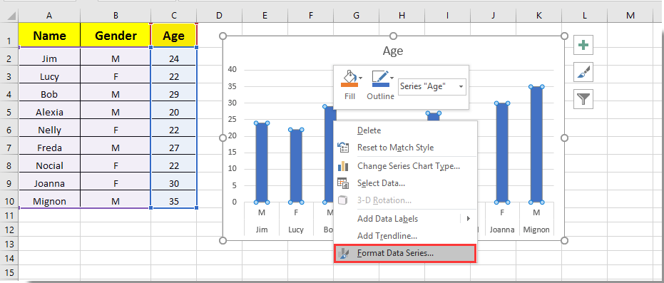
1. Щелкните по любому столбцу в столбчатой диаграмме и щелкните правой кнопкой мыши, затем выберите Формат ряда данных из контекстного меню. См. скриншот:
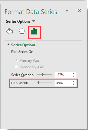
2. В открывшейся панели Формат ряда данных переместите ползунок Масштаб ширины зазора влево до тех пор, пока ширина столбца не будет соответствовать вашим потребностям в разделе Опции ряда. См. скриншот.
3. Закройте панель Формат ряда данных.
После этого вы увидите, что столбцы в указанной столбчатой диаграмме стали шире, как показано на скриншоте ниже.

Раскройте магию Excel с Kutools AI
- Умное выполнение: Выполняйте операции с ячейками, анализируйте данные и создавайте диаграммы — всё это посредством простых команд.
- Пользовательские формулы: Создавайте индивидуальные формулы для оптимизации ваших рабочих процессов.
- Кодирование VBA: Пишите и внедряйте код VBA без особых усилий.
- Интерпретация формул: Легко разбирайтесь в сложных формулах.
- Перевод текста: Преодолейте языковые барьеры в ваших таблицах.
Лучшие инструменты для повышения продуктивности в Office
Повысьте свои навыки работы в Excel с помощью Kutools для Excel и ощутите эффективность на новом уровне. Kutools для Excel предлагает более300 расширенных функций для повышения производительности и экономии времени. Нажмите здесь, чтобы выбрать функцию, которая вам нужнее всего...
Office Tab добавляет вкладки в Office и делает вашу работу намного проще
- Включите режим вкладок для редактирования и чтения в Word, Excel, PowerPoint, Publisher, Access, Visio и Project.
- Открывайте и создавайте несколько документов во вкладках одного окна вместо новых отдельных окон.
- Увеличьте свою продуктивность на50% и уменьшите количество щелчков мышью на сотни ежедневно!
Все надстройки Kutools. Один установщик
Пакет Kutools for Office включает надстройки для Excel, Word, Outlook и PowerPoint, а также Office Tab Pro — идеально для команд, работающих в разных приложениях Office.
- Комплексный набор — надстройки для Excel, Word, Outlook и PowerPoint плюс Office Tab Pro
- Один установщик, одна лицензия — настройка занимает считанные минуты (MSI-совместимо)
- Совместная работа — максимальная эффективность между приложениями Office
- 30-дневная полнофункциональная пробная версия — без регистрации и кредитной карты
- Лучшее соотношение цены и качества — экономия по сравнению с покупкой отдельных надстроек